Posts

Showing posts from 2016

Tomato Shiseido

Image
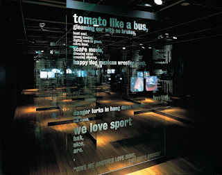
Tomato is a group of artists, designers, musicians and writers who create and deliver cross platform, multi-media art and design projects: both commercial and research based, for national and international clients. One of my favourite pieces by Tomato is Shiseido in which they were commissioned to create an exhibition looking at the two capital cities: London and Tokyo. This exhibition was held at the Shiseido Gallery in Ginza, the show comprised an installation of video, text and sound in a comparison of the cultural similarities and differences between the cities and their people. Six topics were explored; love, food, faith, communication, money and transit. The results created some interesting juxtapositions seen between two cultures. I think this is a brilliant way to compare two main cities and how they may be similar or different when specifically looking at culture. I like how they used transparent displays so you could view the display through multiple layers and combine them t

Jazzberry Blue

Image
Jazzberry Blue, a canadian, self-taught artist creates modern abstract art. He spent his formal years living in India as a painter. Since his return to Canada, digital illustration has become his main form of communication. Blue has created beautifully abstract maps of some of the most interesting cities in the world, including London, Los Angeles, Paris and Milan.  I personally love the way he portrays the maps, using a selection of colours to reveal street patterns, sizes/types of buildings and the general layout of the city itself. The maps also gives the impression of how much urban development there is. I will include his work in my sketchbook as it relates to travel and how different cities can be represented on maps through the use of abstract art.  Looking at other work Blue has created, he uses simple colours to create a skyline using popular landmarks and certain building designs to represent a city. This shows how the architecture is different between cit

Speed and Motion - Character

Image
Adobe Illustrator, Photoshop and Affect Effects For our 3rd workshop with After Effects, we explored animation properties using geometric shapes of our designed characters which were created in illustrator. Our character design needed to be 1920 x 1080 in RGB colour. Different assets were on separate layers, we used simple geometry, shapes and vectors. Properties that we covered in this workshop include: scale, position, set up, shape rigging, parenting,  timeline and keyframes.  With our characters, scenes and sets in our own style, we produce a 10 second animation piece. We looked at 'Catch me if you can title Sequence - 2002, Kuntzel and Deygas' in class as it is a great example of pre-composing. Along with 'The Complete Animade Lernz, by Animade' as another example. The Complete Animade Lernz from Animade on Vimeo . http://www.artofthetitle.com/title/catch-me-if-you-can/ I looked for more project references to help me with my ideas. Adobe

Semiotics

Image
Semiotics is the study of signs and symbols and their use or interpretation. We can explore how systems of signs work to make meaning, through the use of words and images and how we communicate both visually and verbally. Semiotics is about understanding the relationship between messages and meanings. Semiotics is fundamental to an understanding of how words and images are used to make sense of the world along with be manipulated to the benefit of the message. Also how visual communications work and how design choices affects/transform the message being communicated. Good ideas or aesthetics may fall down in the absence of effective communication of the idea through the aesthetic. This is where semiotics comes in, understanding this can ensure we're communicating messages effectively. Signs can be represented as spoken/written language, images, pictures, objects, gestures, codes, symbols and sounds. All which can have an emotional impact, or mean different things to diff

Type

Image
" The physical embodiment of a collection of letters, numbers, symbols, etc. (whether it’s a case of metal pieces or a computer file) is a font. When referring to the design of the collection (the way it looks) you call it a typeface. " – Mark Simonson, designer "The liveliness of asymmetry is an expression of our own movement and that of modern life, it is a symbol of the changing forms of life in general."  - Jan Tschichold Since its initial publication in Berlin in 1928, Jan Tschichold's "The New Typography" has been recognized as the definitive treatise on book and graphic design in the machine age. Herbert Bayer (April 5, 1900 – September 30, 1985) was an Austrian and American graphic designer, painter, photographer, sculptor, art director, environmental and interior designer, and architect, who was widely recognized as the last living member of the Bauhaus. Bayer's 1925 experimental universal typeface combined upper and low